Roll your own lazy loading
An example of powering picture elements for responsive images with lazy loading, using Netlify Image CDN.
Take a look at the code on GitHub, or read on, for more explanation and examples.

Image transformation
Thanks to the Netlify Image CDN, we can take advantage of the ability to perform on-the-fly image transformations to deliver resized and cropped, versions of the images, in the best format for the user's browser, directly from Netlify's optimised edge infrastructure.
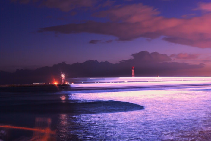
Netlify Image CDN transforms and caches image assets if you make requests via a special /.netlify/images/ URL, and add querystring parameters.
For example, the image below can be served in any size:
- /.netlify/images/?url=/images/lighthouse-5.jpg?&w=20
- /.netlify/images/?url=/images/lighthouse-5.jpg&w=500
- /.netlify/images/?url=/images/lighthouse-5.jpg&w=700
Abstract with helper URLs
To clean these URLs up a little, we can use Netlify's Redirects API to create some more friendly and abstracted URLs which proxy to the querystring decorated URLs:
- /images/tiny/lighthouse-5.jpg → /.netlify/images/?url=/images/lighthouse-5.jpg&w=20
- /images/small/lighthouse-5.jpg → /.netlify/images/?url=/images/lighthouse-5.jpg&w=500
- /images/original/lighthouse-5.jpg → /images/lighthouse-5.jpg
The redirects and transformations even work locally to ease your development efforts if you run your local build with Netlify Dev
Using the picture element
These images have been added to the page in various sizes, using the picture element with multiple image sources.


A picture helper
Whatever tool you use to generate your HTML, chances are that it includes a facility to make shortcodes or macros.
This example uses a static site generator called 11ty which gives us the ability to make a shortcode to output picture tags with many image source attributes including transformation parameters automatically added to the image urls.
This shortcode:
{% lazypicture lighthouse.jpg "A snazzy lighthouse" %}outputs this html:
<picture class="lazy lazy-initial">
  <source srcset="/images/tiny/lighthouse.jpg" media="(min-width: 1200px)">
  <source srcset="/images/tiny/lighthouse.jpg" media="(min-width: 740px)">
  <img src="/images/tiny/lighthouse.jpg" alt="A snazzy lighthouse" />
</picture>
This sets each image source to use a tiny (typically less that 1k) version of the image. With some CSS, we size the image to fit and add some blurring to smooth it all down nicely.
Then, thanks to the magic of the browser's Intersection Observer API. We can detect when our images come into the viewport, and use JavaScript to update our image sources to use more appropriately sized images in our responsive picture element.
Removing the CSS class which applies the blur once our new image source is loaded completes the effect.
Get started with Netlify Image CDN
Need some reference code to get you going? You can clone the code for this site to use as an example.
Once cloned, you can run the build locally or push to Netlify and start getting the benefits of the Netlify Image CDN right away.